18. JEFFREY SMART
It would be possible to do an entire exhibition of paintings by Jeffrey Smart featuring buses and trucks. Yet where the back of a truck usually appears as a bold geometric shape a red square on grey asphalt, the buses are treated more playfully. In The Traveller 1973, a bald-headed man in an overcoat (allegedly a portrait of Vladimir Nabokov) has stepped off one bus only to find himself reflected in the gleaming metal hull of another. Is Smart suggesting that the ultimate goal of travel is self-discovery?
One can almost feel the artists pleasure in painting the wavy reflections on the shadowy side of the bus. In another work from the same year, Near Knossos 1973, we see only the top half of a bus and the trace of another parked alongside. This time the most engaging aspect is the repetition of windows and seats, which form neat fugal patterns.
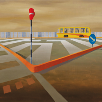
Theres a similar brightness in Bus by the Tiber 1977-78, a severely geometrical picture than hints at one of Smarts occasional spoofs on abstract art. The white lines laid out in maze-like fashion on the grey road seem utterly mystifying when we pause to wonder how they are supposed to regulate the traffic. A red stop sign has curled up like a flower, a blue arrow points to an apparently arbitrary spot on the ground. The thin orange bollard that encloses the central triangle curves away to the left, as if seen through a distorted lens.
The road is a mixture of pale grey and brown, the sky is a dirty yellowish smear across the top of the canvas. A strip of interlocking blue, white and pink apartment blocks runs across the picture at a carefully calculated interval. Into this bare urban landscape the bright yellow bus arrives like a sudden burst of happiness. The jazzy orange stripe on its side is a perfect match for the curved orange bollard on the road. Positioned between the red and blue signs, it completes the triumvirate of primary colours.
Inside the bus we can see a few shadowy figures, but they are of no more importance than the silhouettes of seats and window curtains. Although Smart often includes a figure or two allegedly for purposes of scale, but also, I believe, to add an extra note of ambiguity - there is no human dimension in Bus by the Tiber. Whatever we might find in this picture is purely a matter of form, colour and composition. Yet when it comes to creating a suggestive scenario through largely formal means, few Australian artists have been so skilful as Smart.
The pronounced emptiness of Bus by the Tiber raises one of the ongoing conundrums of the artists work, as it would be easy to claim this is a study in alienation. Surely, the argument goes, those great swathes of asphalt, the relentless uniformity of the apartment blocks, the absence of human beings, all add up to a depressing portrait of modern urban life.
One problem with this interpretation is that it doesnt align with anything Smart himself ever said about his paintings. Over the years he consistently rejected such proto-Marxist readings, arguing that he found a real beauty in those scenes in which others saw only despair and loneliness. He wasnt saying he would have liked to live in a pokey apartment in a concrete block or travel every day in a bus. His simple point was that its too easy to allow our political and social convictions to determine the way we look at the world around us.
Smart believed that if one stood back and tried for a more objective view of modern life, there was no shortage of striking subjects. Those dull expanses of asphalt and concrete serve as a perfect backdrop for vivid flashes of colour. The geometric patterns we admire in abstract paintings are all around us on the streets and walls of cities.
For Smart it was important that a painting should be viewed, first and foremost, as an aesthetic artefact, not a political statement. If his motivations were not always as purely formal as he would have us believe, this is the way he consistently spoke about his own work. Such sentiments helped put a brake on critical over-interpretation, or the bad habit of reading works of art as documents which support or offend our personal ideological preferences.
Smart frequently let it be known that he did not view the artist as a prophet or a seer, let alone a prophet of doom. In fact he had a much humbler conception of the artists role, quoting Czannes idea that art was a priesthood that should be pursued only by the pure of heart. Smarts ideal artist was a connoisseur of beauty, even if it should appear in the most unconventional guises. We may wait a long time for a bus in a barren, urban environment, but when it finally appears its the most beautiful sight on earth.
John McDonald
TOP