51. JEFFREY SMART
Jeffrey Smarts work belongs to a golden era of Australian painting, and his career runs parallel to the best known names of Australian modern art. Unlike his contemporaries Sidney Nolan (1917-1992), Arthur Boyd (1920-1999), John Perceval (1923-2000), Albert Tucker (1914-1999), Brett Whiteley (1939-1992) and John Brack (1920-1999), however, Smart rarely engaged directly with Australian subject matter. Although he exhibited in Australia, and the great majority of his audience and his collectors lived there, his art is never specifically Australian and, if anything, avoids (with rare exceptions) geographically specific content altogether.
Nevertheless, the exotic locales of Night Stop Bombay, Fiumicino, and Autobahn in the Black Forest flavour his anonymous, abstract cityscapes. Smart loved to travel and yet the paintings that use these exotic titles rarely have anything to do with the place. For the most part his paintings defy any effort to regionalise them.
The point is that the subjects relationship to its title is quirky: it is sometimes contradictory, suggestive, funny or ironic. There is no doubt that Smarts somewhat arch humour, particularly evident in works such as Margaret Olley in the Louvre Museum (1) and Portrait of David Malouf (2) provides an additional layer of interest which engages the viewer.
None of Smarts paintings can be read purely on face value. His inclination, characteristically expressed in his autobiography Not Quite Straight, is to be modestly subversive. This memoir, expressed in unspectacular, dry prose, describes the events and people of his life, but you wont find discussion of his paintings or working methods. Their mystery deepens. Seasoned Smart-watchers know that his work rewards careful examination as well as use of the imagination and they draw pleasure from analysing it and deducing the references he strews about.
Considering his disposition to be arcane and often obscure, it is remarkable how downright popular his paintings are. Smart exhibitions are always great box-office events: crowd numbers exceed previous records; the catalogue sells out and goes into second and third editions; the paintings are all sold and his prices go through the roof.
Its clear that on the one hand Smart relishes what students of the Renaissance might call iconographic depth. Symbols, allegories and euphemisms abound. We therefore expect that when we come to look closely at his paintings, after enjoying the intricacies of their construction and the poetry of their mood, we are confronted with the challenge of trying to understand it or at least be able to gauge the depth of its meaning.
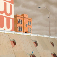
House by Hoarding 1968 is a good example. Smart has named the painting descriptively: we see a building - part of it, at any rate - in the centre of the composition. Next to it is an advertising hoarding to its left. While we can gain a fairly good notion of the house, the hoarding is abbreviated on three sides and the advertised brand and product are indiscernible. Smart never shied away from using recognised brand names and may have even been guilty of flattering his collectors by introducing their own products into his compositions(3), but generally he introduces text or script as a means of enriching the painting visually more than iconographically. In House by Hoarding the hoarding ironically tells us nothing. The W shapes do make a visual reference to the house by the inverted mirroring of its paired windows. The main colour of the hoarding is also related to the colour of the house. Its not a match, and yet its close enough to raise the question of relativity. The house is painted a warm shade of reddish umber- its a particularly Italian colour, suggesting Tuscany. It is also a weathered colour, washed by patches of light variation in tone and colour. The hoarding is a decidedly rosier colour it is cooler, with a possible admixture of blue to vary it from its neighbour. These two, adjacent variants of earthy red may at first seem puzzling to the viewer. Its an odd placement, as the colours are so closely related and yet different enough. A clue might be found in the finely painted windows of the house, where Smart has used blue, so that the combination of blue and reddish umber might equal the rose of the hoarding. Its an almost mathematical equation of colours. Smart was a devotee of geometry and an adherent of the principles of the Golden Section so we must not be surprised at arriving at such an unlikely conclusion.
Across the lower half of the painting is a broad, diagonal bank of what appears to be concrete. A white barrier fringed with delicate green grass divides the painting in two. The surface of the concrete is varied, with the texture and different tones denoting planks or panels. This is in turn broken up with a rhythmic pattern of coarse holes which show the earth beneath them. The holes were made for the purpose of planting greenery (4), but Smart uses them to deploy a further variant on the red-pink tones he has used on the hoarding and the house, and all are compositionally related. Smart has devoted immense effort to painting these, with attention to shading, depth and texture seemingly out of all proportion to their overall importance within the painting. This compositional device is reminiscent of Smarts famous Portrait of Clive James (5), in which the subject is comically demoted to the status of a small pivot point in the far more important business of balancing out the composition.
The curious holes rhythmically spaced across the embankment in House by Hoarding appear to have only a formal function, rather like the wallpaper we see in some Czanne portraits (6). Smart was a devotee of Czanne and in Not Quite Straight details his visit in 1948 to Czannes former studio near Aix-en-Provence (7). The holes in the present work also resemble musical notation: crotchets, quavers, and notes.(8) They are patterned according to a considered program: the upper three holes are d-shaped, owing to their position at the edge of a panel, while the lower three are more circular. Smart was a passionate music buff and often travelled abroad to attend concerts, especially of his favourite composer, Wagner. Why not introduce an added dimension by making a veiled reference to music in this way? Using the rhythmic qualities of music is definitely within Smarts kitbag of technique.
And now we come to the gimmick, what Alfred Hitchcock s might refer to as the maguffin (9). This is the name given to a narrative motif or theme that occurs without elaboration or explanation and which invisibly generates the progress of a film plot. In this case it takes the shape of a rod, tipped with blue, protruding from one of the holes. There is also an accompanying shadow. The intention of these apparently throw-away elements is to reverse expectations and cause them to come to the centre of our attention - as if these elements are indeed central to the meaning of the painting, or its natural centre of gravity. Smarts paintings typically have the effect of forcing us to give serious consideration to an elements purpose and to attempt to interpret it, especially such a centrally placed motif. Is it a phallic symbol? If so, its an affront that is not beyond Smart. If that is what it is, what does it ultimately symbolise - sexual frustration? Perhaps it is best not to speculate too freely.
Returning to the house, it is worth remembering that this is referred to in the paintings title and is ostensibly its subject. In actuality, the house seems a pretty dreary, banal sort of building - although, as always, Smart enlivens it with windows and blinds, architectural mouldings and cornices, all of which are beautifully and precisely painted in Smarts exacting style. Open and closed windows, partially shut blinds, and the use of black subtly enrich the faade. A face emerges - eyes (hooded, or winking), a hairline, a nose and a mouth: its the face of a person. Is House by a Hoarding a sort of head study, possibly in the vein of the famous Renaissance portraits consisting of fruits and vegetables by Arcimboldo (1527-1593)?
Can it be that House by Hoarding is intended to be an oblique portrait, or even a self-portrait? Smart produced numerous self-portraits throughout his lifetime: Self-portrait at Papinis, (10) another painting with some fairly ambiguous sexual references, and his late Poussinesque masterpiece, Self-portrait 1993 (11) a remarkable tour de force of composition and balance.
Footnotes
- Margaret Olley in the Louvre Museum, 1994-95, Art Gallery of New South Wales collection, Sydney
- Portrait of David Malouf, 1980, Art Gallery of Western Australia collection, Perth
- This occurs very rarely in Smarts work; however one example is Joining the Ring Road 1989 which includes a truck with the Linfox logo on the door. The target rejected the overture and the painting was duly sold to another collector.
- Quartermaine, P. Jeffrey Smart, Gryphon Books, Melbourne, 1983, p.28
- Portrait of Clive James, 1991-92, Art Gallery of New South Wales collection, Sydney
- Self-portrait, 1993, University of Queensland collection, Brisbane
- Quartermaine, P., p.29
- An example might be Czannes 1879 Self-Portrait, in New Yorks Metropolitan Museum of Art, or Madame Czanne in a Red Armchair, c1872, Museum of Fine Art, Boston
- Smart, J., Not Quite Straight, Vintage, Sydney, 2008 pp.211-217
- Private Collection
Tim Abdallah