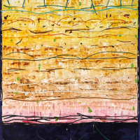
55. MICHAEL JOHNSON

Michael Johnson is perhaps the most steadfast abstractionist in Australian art, so it is all the more surprising that he started his long and distinguished career as a commercial artist. His father Percy had worked before and during world war two as an illustrator, specialising in black and white work for the newspapers of Sydney while his mother worked as a fashion designer. Young Michael worked at his fathers side, taking in his teaching on the elements of design and the centrality of observation and practice in the realisation of a work of art. It was a training that saw him able to leave school at 14 and get work as an illustrator with the Lintas agency in Sydney. By the time he started part-time studies at the Julian Ashton school in 1953, Johnson was already an accomplished draughtsman who could draw the figure with great style and confidence. While also attending night classes at East Sydney Technical College, he spent his days designing and illustrating advertisements for the Australian Womens Weekly and Womans Day before heading for Europe and to study and work in London. He continued to work as an illustrator, but also took on work as studio assistant to sculptors Brian Wall (born 1931) and Anthony Caro (1924-2013). The elegant abstraction of Caros work in particular reinforced his belief that art could exist without the need for narrative and reference to the physical world. By the early 1960s American abstract expressionism had become the irresistible force in world art and Johnson was impressed by its strength and power. It was in Britain that he first started to develop as a painter, to concentrate on the fundamental elements of painting - the colour, line and form that he put to use as an illustrator, but scaled up and freed from the necessity of description. His first works, in the fashion of the time, were hard-edged abstracts, a direct progression from the design language of his commercial work. He took to heart the fundamental thesis of abstract expressionism, that the making of art is in fact the subject of art, and made it central to his work - the physical elements, refined and emphasised for their own sake. Time spent in America took him down the path of a more painterly style, leaving the hard geometry of his earlier work behind. His paintings began to feature great swathes of pure colour, which are overlaid with veils of lines and marks, brushed on with the subtleties of touch clear in every stroke. The gestural marks and shapes are repeated over and over again, each one different but building up patterns which dance across the surface. Johnson will work a whole series of paintings predicated on one colour - a rich raw umber perhaps, or cadmium red, over which he will ring the changes until he has extracted every ounce of energy from his fundamental premise. Some of his contemporaries, like Fred Cress (1938-2009), painted themselves into a corner and reverted to the academic realism of their early training, while Michael Johnson remained true to the painterly abstraction of the 1960s. His works have infinite variety and subtlety and continue to speak to his public because of his dedication to the skills and vision of a master painter. While as a young man he once observed that his work had something of the style and technique of Botticelli (c1445-1510), in the 21st century it is hard to find an artist who has so steadfastly remained consistent to his place as a lyrical abstractionist of the first order.
Gavin Fry